If you require subscribers to confirm their subscription requests, you can’t start the email conversation until they do. So a lot is riding on your confirmation email. Is yours up to the task?
We agree with email veteran Andrew Kordek, who says confirmation requests are “often devoid of personality and lack effectiveness.” Opt-in requests often come from IT, not the marketing team—and don’t do anything to make a busy person want to open or click on the confirmation link.
Is your confirmation rate below 80 percent? Revamping your confirmation request could persuade more subscribers to take that next step. These three insights and tips can help you kickstart your research and redesign process.
1. Break free from plain text
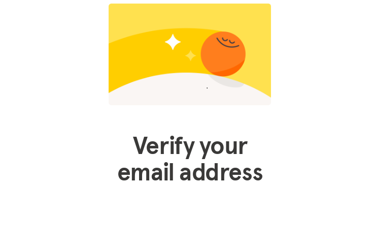
Many confirmation emails use plain text or minimalistic design because of fears that formatted emails get lost in ISP filters. Allay those worries with a well-designed, filter-tested email template that reflects your current branding and value proposition. This Headspace email is a great example.
Need more ideas? You bet we have lists for that! Start with our curated Account Confirmation collection to get email inspiration for subject lines, designs, and persuasive copy.
Then, if you’re limited to plain text or minimalist design for this kind of triggered message, get ideas on our new Plain Text Emails examples list to create a confirmation email with maximum impact.
2. Confirmation requests are sales jobs plus value-proposition reminders
Most confirmation requests focus on the click. Let customers know the great things that await them after they click. Showing the value of that extra action could persuade more would-be subscribers to open the email and click the link (or send the code, if that’s how you roll).
Help your subscribers take that extra step. Make it as easy as possible to click your confirmation or verification link. Use a big, colorful call-to-action button instead of embedding the link in the copy, and write a button copy that tells subscribers what will happen when they click it.
Keep trying: If at first they don’t click…send a second email repeating your request and double down on the value and ease of subscribing. This Frank Body email is a world-class example.
3. Explain the WIIFM in the subject line
The inbox is crowded and noisy. Your subject line must remind customers why they opted in because they might forget about it a few minutes later. Our favorite so far, from a Blue Nile email: “Don’t miss the latest and greatest-confirm your email now!”
Here’s another helpful source: our Subscription Onboarding journeys. Look for helpful nudges that combine persuasive copy with brand-building design.
For more helpful email examples for all stages of the customer journey, sign up for a free MailCharts account!


