If you want to stay top of mind with your customers, sending out email newsletters is a great way to do so.
Typically, email newsletters are sent at a specific frequency. Most common are monthly newsletters and weekly newsletters. They are a core element of your email marketing strategy and contain brand-relevant content such as information on upcoming events, important updates, a look behind the scenes, and links to recent blog posts. As such email newsletters help you drive traffic back to your site.
They can also help you drive sales when you use them for promoting products.
Whatever angle you choose, each email newsletter you send should provide ongoing value, encouraging subscribers to keep engaging with your brand.
Types of Email Newsletters
An email newsletter can cover a lot of different things. Based on the thousands of ecommerce newsletters we’re tracking, we’ve distinguished between eight different types:
- Discounts: These newsletters include but are not limited to a focus on seasonal sales, clearance, or special holiday promotions.
- Product Updates: Typically, product updates can include a product announcement or updates on improvements of existing products.
- Holidays: Holiday newsletters are self-explanatory as they focus on a specific upcoming holiday and promote products or content related to that holiday.
- Gift Guides: Another newsletter type that’s relatively self-explanatory: gift guide newsletters. These can be sent at any time but are frequently sent around the holiday season.
- News: News-specific emails can tie closely with the blog roundup category as they typically feature news content directing users to click through to read more in an article.
- Blog Roundup: These can be news specific or editorial but typically focus on driving subscribers to blog posts and not to product purchase pages.
- Events: B2B companies use events often, but with the current state of the world, we’re seeing more virtual events in the eCommerce space, too. Events promotion can cover both in-person and virtual events.
- Tips & Tricks: Tying back to the blog category, this newsletter type shares links to helpful content to bring users back to the site where they can read more. Oftentimes, the links go to strategic content that indirectly promotes products and as such helps drive conversions.
- Membership Exclusives: Exclusive membership or loyalty newsletters are a great tool to keep your biggest fans engaged with your brand.
Check Your SenderScore Now to See How Mailbox Providers View You as a Sender.
A Few Best Practices for Your Email Newsletters
1. Tailor your newsletter content
The most successful newsletters are the most targeted and tailored ones. Segment your email list based on the specific topics your subscribers are interested in, their past purchase behavior, the way they engage with you, and any other relevant data you have. Then, create different newsletters for the different audiences within your target audience.
2. A/B test your newsletters
One of the best practices for improving any type of digital marketing strategy is A/B testing. A/B test your email content, subject lines, email footer, layout, and email offers to ensure you’re optimizing for the best experience.
Many email service providers (ESPs) have built-in A/B testing tools to make testing easy. They also allow you to play with your send frequency so you can figure out what works best for you: a monthly newsletter, a weekly newsletter, or maybe one that you send every so many days.
It’s important to note that what may perform well for one company’s ecommerce newsletter may not work for your brand as your target audience might be different, even though you’re selling similar products.
3. Stay true to your brand
It’s easy to go a bit crazy when experimenting with your newsletters. Before you know it, they won’t look like anything subscribers can find on your website or social media accounts.
Consistent design can strengthen brand recognition, as can the tone of your emails. Perhaps your email copy always carries a friendly tone, or maybe it’s a bit cheeky. Define which characteristics are key to your brand and include them when you create newsletters.
Some of the Best Newsletter Examples
Using MailCharts data, we pulled together some of our favorite email newsletter examples in the eight categories we’ve defined above. In addition to the newsletter examples below, you can find many more newsletter examples by signing up for a free account.
Discount newsletters
In this email newsletter example, Michaels sells art and crafts supplies for people looking to refresh their home decor. We love this discount newsletter because contrary to what most promotional emails do, it offers subscribers value before highlighting current discounts.
The Facebook live event, the craft ideas, and the tutorials all serve to inspire shoppers to create something new. Due to this, readers are already excited and in a “warmed-up” state by the time they reach the offers at the end of the email where they may be more likely to take action.
We also like how they put the important information about their changed opening times at the top of the email in an unmissable red box. The rest of the email contains equally bright colors which is very on-brand for Michaels. Note how the bottom section of the email contains another red box with enticing practical information: a free shipping offer for those who buy for more than $59.
Hey, you 💛 You've unlocked Easter projects & treats for your fam.
Verify the accuracy of 500 email addresses in your database for FREE with Briteverify.
With simple email newsletter design elements and clear product shots, this newsletter example from retailer TOMS draws the readers’ attention to the unique patterns of its geo-woven collection. Subscribers get to see what the shoes will look like on their feet, which patterns are available, and the texture of the fabrics up close.
Buying TOMS isn’t just a choice of style, it’s also a sign of support. With the announcement of the TOMS Global Giving Fund, the brand speaks to people’s desire to give back. This timely update softens the promotional character of the email and doubles down on the company’s core mission and values.
Espadrilles with geometric patterns | 35% OFF
This discount newsletter example by Ashley Homestore plays cleverly with the “You’ve got mail” theme in its subject line. The body of the email doesn’t just list a bunch of discounts but guides the recipient through completing their closet by first showcasing a beautiful closet system, then by listing different closet accessories, and finally by offering visual inspiration to design a dream bedroom. Discounts are mentioned at the top and bottom of the email, enticing the subscriber as they get start envisioning what their upgraded closet could look like.
📬 You've Got Deals | Shop the Labor Day Preview
Product updates
Software company Litmus uses colors and text styling to make their newsletter content easy to digest. Each section in this product update gets a designated color with a matching header image and call-to-action button. The large and bold headings make the email scannable while the clear CTA texts let subscribers know exactly what they’ll get if they click. It is thanks to this newsletter design that Litmus can share product updates, new features, case studies, resources, and even an event update in a single email without overwhelming the reader.
☀️ Hotspots just in time for spring
Society6 takes a different approach and focuses on a single topic in this email newsletter example: office decor inspiration. Right at the top of their newsletter, they call attention to a 30% off sale. This entices readers to click through when scrolling through the rest of the email.
The rather simple product email design and usage of large images makes it easy to envision what your home office could look like. The brand provides additional value by adding blog content around your office environment with “8 Tips to Make Your Home Office Work for You”. Lastly, the Zoom Background Quiz offers something fun, timely, and topical, without hard-selling readers on products, making it a great newsletter example.
Office Decor Inspiration | First Sip of ☕
Foot Locker’s subject line tells you in a few words what this product update is about and after opening the email, the content is focused and clear. It showcases their new sneaker against a colorful rasta background sporting the famous Jordan logo. The black-on-white text is easy to read and contrasts nicely with the white-on-black CTA buttons.
Launching: Women’s Jordan Retro 4 ‘Rasta’
Holiday newsletter examples
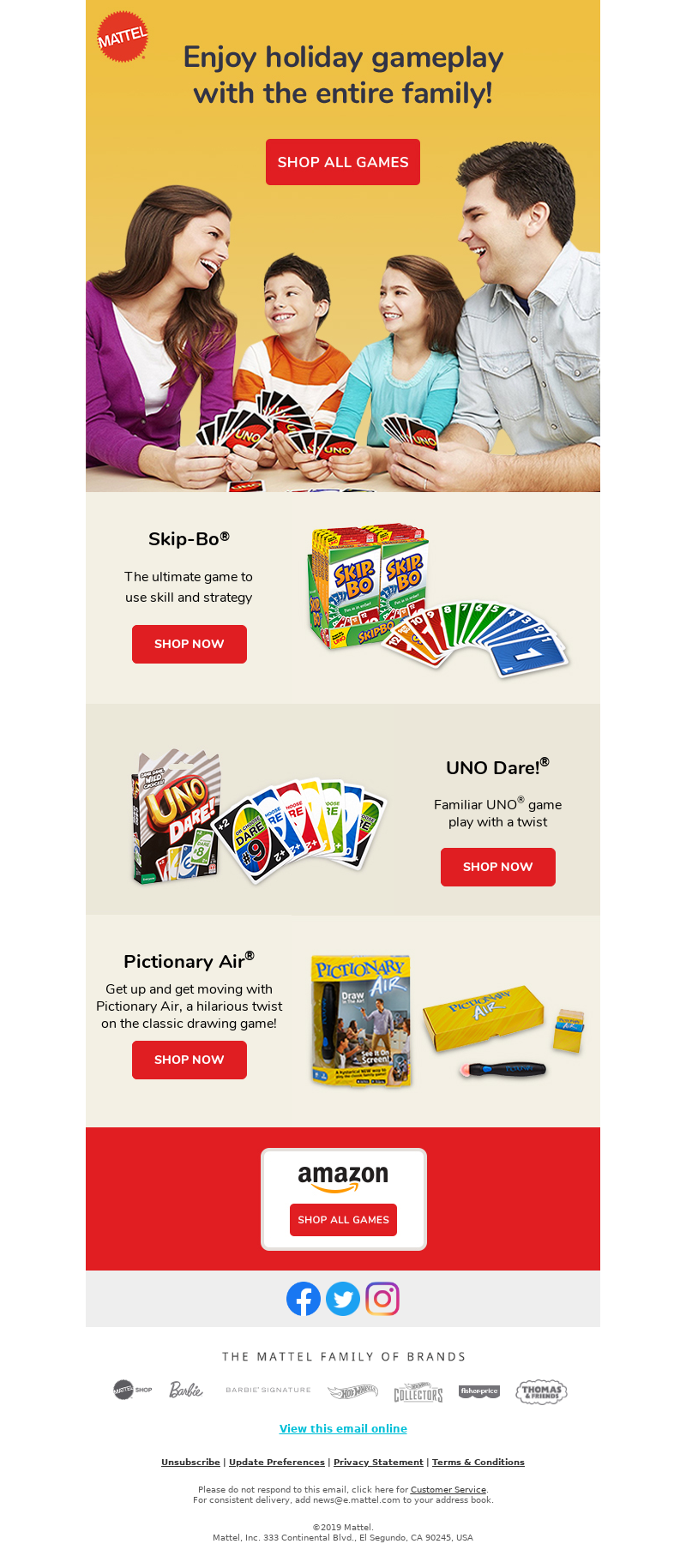
Holiday emails are often over-the-top and with the number of newsletters sent during this period, many get lost in the shuffle. This email newsletter example by Mattel keeps things subtle by referring to the season in the subject line and mentioning briefly in the introduction. The photo of the family playing games at the top of the email is a warm introduction to a brief and to-the-point newsletter. The short product descriptions pique the reader’s interest and urge them to click the bold red “Shop Now” CTAs.
Need stocking stuffers? Shop our games!
Online flower store UrbanStems ticks a lot of boxes with this Mother’s Day newsletter example. The header message acknowledges what’s going on in the world and how it affects moms in particular. The boxed design of their newsletter template and high-quality photographs make their products stand out and CTA buttons in between sections make it easy to complete a purchase.
We also love how UrbanStems offers flower subscriptions as an alternative option for those who want more than a single bouquet. Its holiday email concludes with an easy opt-out from Mother’s Day-specific newsletters which is considerate for those shoppers who are sensitive to the Mother’s Day holiday.
Our newest shop
H&M uses Halloween as a reason to promote its loyalty program in this newsletter example. It includes an incentive (10% off) and highlights the benefits shoppers get when joining in this newsletter example. The “join for free” CTA makes it clear that signing up is risk-free but H&M also offers a secondary CTA for those not ready to sign up to simply “learn more”. Using multiple CTA buttons can increase your click-through rates if you use them wisely.
The Halloween theme itself is mostly established by the top image which showcases H&M products as well as the subject line, allowing the rest of the newsletter to stay on-brand in terms of email design and brand colors.
A Halloween treat: open if you dare...
Gift guides
Gift guides can be a powerful tool to get people to your store. Woolrich places product categories at the very top of its email followed by a free shipping promotion that encourages users to click through even before they’ve read the email. The hero image and following product images present the products in a natural way and the accompanying text specifies who the products are meant for: for her, for him, for kids, and for those who need accessories. Each section also has its own CTA. This strategy makes the guide clear without it needing to be text-heavy.
The Summer Gift Guide is here
This gift guide newsletter example by online gift shop HardToFind uses colored banners to separate different gift guides. These guides are based on hobbies, making it easy for the reader to scroll through products that interest them without getting overwhelmed by options. In addition to the gift guides, they feature a photo of one of their small business owners, bringing to life what their brand is about while also acting as a break between the themed gift guides and the additional gift finder section. This final section allows shoppers to check out gifts for specific groups like: “gifts for mom”, “gifts for him”, and “gifts for couples”.
Hobby inspo for iso 🎨
This holiday gift guide by Tactics stands out because of the simplicity of its newsletter design. The recipient only needs to make one choice: are they looking for a gift for a skater, or for a snowboarder? The newsletter makes a clear distinction between both types of lucky gift receivers with large images and popping copy. And just in case that doesn’t get the recipient to click, the email lists the newest products in store.
If you’re running a multi-email holiday campaign, it’s always a good idea to make at least one email a gift guide.
🔔 Holiday Gift Guide Is Here!
News
AngelList’s newsletter packs various updates into one email so that it doesn’t need to flood the people on its email list. The startup and investor platform keeps its newsletter clean with simple design elements such as black-on-white text, blue call-to-actions, and a featured story at the top.
Each section of the newsletter is dedicated to a different type of update and is separated from the other sections by a blank space. The featured story takes up the whole width of the email while the other tech news reads more like a blog post feed. The fundings and acquisitions section uses bolded names and numbers to help readers quickly skim without reading each word. This email is a great example of how you can use email as part of your content marketing.
Todd Jackson's advice for future founders
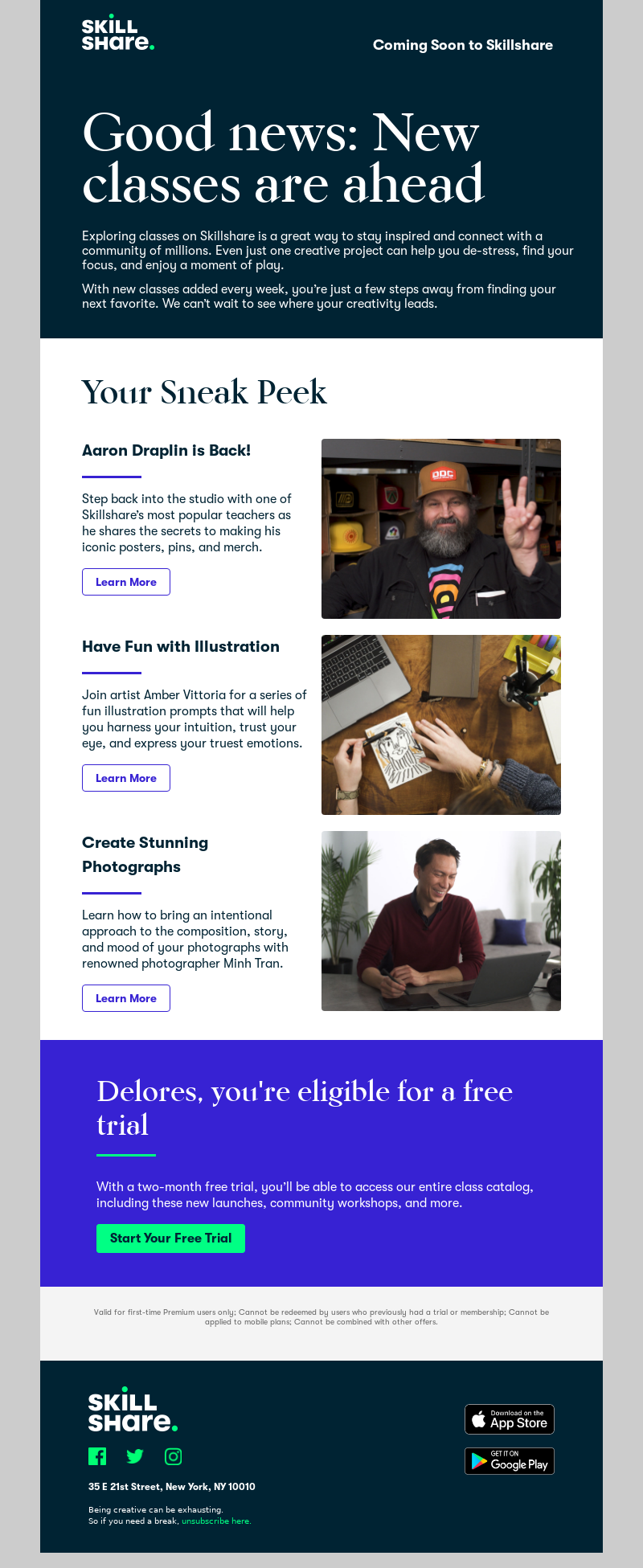
Online course platform Skillshare does a great job of including positive messaging (“stay inspired”, “de-stress”, “find your focus”) before getting to the actual news in this newsletter example. Its “sneak peek” makes it clear that the featured courses are just a few of the many they have to offer and allows the brand to keep its newsletter short while still sharing information about every course. The free two-month trial offer at the end of the newsletter is impossible to miss with its fluorescent green CTA button against the bold blue background.
Brighten your day with a peek at new classes
Blog roundup newsletters
AIGA’s Eye on Design blog roundup does exactly what the design magazine is known for: showcasing designs by emerging and established designers. They use a simple template that focuses on the designer’s work accompanied by limited text so readers learn more. Interestingly enough, the only clear CTA button is not one that urges the readers to click through to Eye on Design’s website, but to share the newsletter with a friend.
Design’s role in a public health crisis, getting more women in leadership positions, the fantastical world of face filters + more
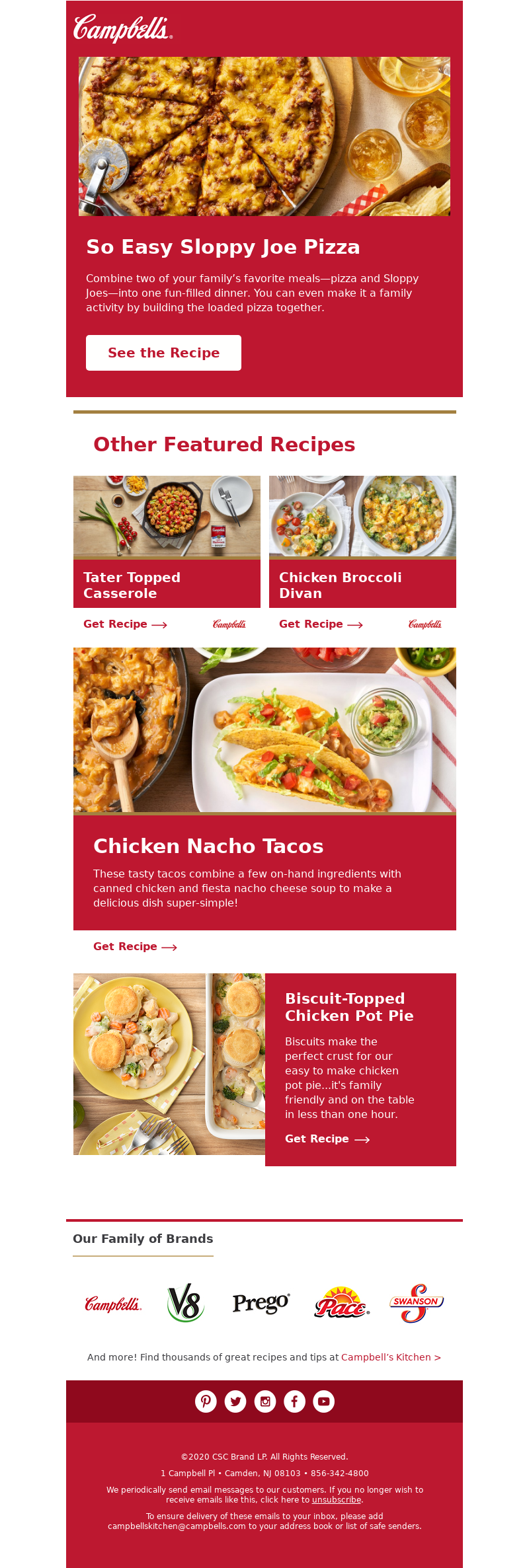
The usage of large red blocks for individual recipes makes Campbell’s roundup newsletter example easy to skim. The combination of red CTAs on a white background shows off their iconic branding colors. Also, they sprinkle Campbell’s logo throughout the email making this the perfect on-brand blog roundup without being too over-the-top.
Grab the Kids & Get Cooking in the Kitchen
Sexy men’s brand Andrew Christian catches the recipient’s attention with a subject line that instantly tells them they’re going to learn something important when reading this blog roundup newsletter. The subject line, which is also a blog post title, is repeated at the top of the newsletter as a featured article. Next up are two other blog posts before a discount banner clearly announces a break in the newsletter design and starts the next section featuring new products. It’s a great way of tying valuable content and promotion together.
4 Tips To Avoid Misgendering Someone
Event newsletters
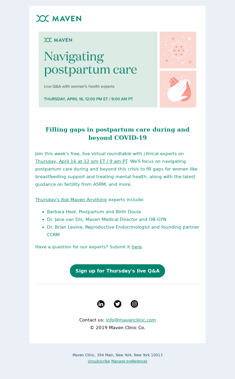
We love how this email from healthcare company Maven has a single focus: promoting their virtual live Q&A around postpartum care. The email clearly describes what participants can expect and how they can register. Maven also works a mention of the current times naturally into the headline, assuring readers that this roundtable will be relevant now and in the future. The main CTA stands out due to the button color and email focus.
Join our live Q&A with experts: Navigating postpartum care
Diamond store Zales shows that you can turn jewelry shopping into an event. It instantly addresses the need for personalized recommendations when shopping for a high-ticket item and offers customers three easy ways to get the help they need by making a virtual appointment, chatting with customer support, or connecting with a jewelry expert.
We Are (Virtually) Here For You!
Kiehl’s email is a combination of sales promotion, product promotion, and event promotion in their newsletter. The event section stands out because of the colorful Instagram logo and icons used. Kiehl’s organizes an Instagram live session every day of the week (except for Saturday). This is a great example of a brand promoting social media events via email. Subscribers who watch these Instagram Live events will have Kiehl’s top-of-mind and likely generate sales or at the very least, a few more social media followers.
Self-Care Through Skincare
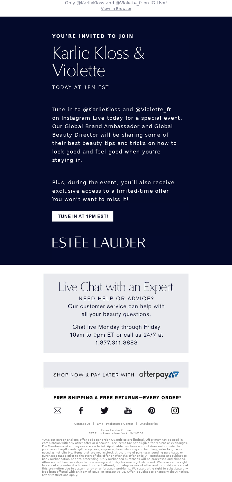
Estée Lauder’s event newsletter addresses the subscriber directly (“You’re invited”) and has a feel of exclusivity. Not only will attendees get tips from the brand’s own Global Brand Ambassador and Global Beauty Director, but they’ll also get access to a limited-time offer. The white call-to-action button contrasts nicely against the dark background and tells the reader when the event is happening. This is a refreshing take on an event newsletter as it doesn’t include any product promotion which is refreshing to see from a retail brand.
📱 Join Karlie Kloss & Violette on Instagram Live—Today at 1PM EST!
Tips & tricks
This email newsletter example by online baby registry Babylist is full of value for parents or soon-to-be parents. All the stories featured contain parenting tips and links to a longer post on their website with clear CTAs. In addition to its parenting tips, it shares the results of a previous survey and encourages readers to participate in a new poll. They include additional value by adding in a small shopping section, a giveaway, and links to recent articles.
Why Your Work’s “Generous” Parental Leave Does More Harm than Good
This newsletter example by Etsy might just be our favorite. Instead of putting tips and products next to each other as many newsletters do, Etsy combines both with a fun DIY project. Every step of the project requires the reader to use something that can be bought on Etsy. This makes the product promotion less explicit and ensures that the email is an entertaining read regardless of whether the reader is interested in the products.
Today's delicious DIY? Edible terrariums
Membership newsletters
Menswear brand Mack Weldon has gamified its loyalty program and in this members-only email newsletter example, it’s congratulating a customer on having reached Level One: free shipping. Offering free shipping is a great way to entice the customer to drive conversions, especially when the customer can get to Level 2 by spending $200 before a certain date. The combination of the sense of urgency created here and the gamification creates a strong incentive for the recipient to take action.
How to unlock more perks.
This welcome-to-the-club email newsletter example is the first of many members-only newsletters Icebreaker loyalty members get. It instantly creates a sense of belonging and emphasizes how the recipient has made a good choice by signing up and “helping us all to live a more balanced, sustainable and healthier life”.
The email then lists all the benefits members can enjoy, followed by a clear call-to-action to “start earning” (reward points).
It’s Good to Belong
Should You Use Email Newsletter Templates?
It usually doesn’t make sense to use just one newsletter template if you send out different types of newsletters, as you’ll want to make them recognizable for your audience. It is, however, a good idea to create a few newsletter templates per type of newsletter you send out. This will help you save time and also makes it easier to A/B test your email newsletter design and copy.
Where to Find More Email Newsletter Examples
If you’ve made it to this part of the article, you’re probably on newsletter overload and may be feeling overwhelmed. With the help of MailCharts, you can research specific industries and see what types of newsletters your competition is sending.
Our industry emails are split out into 13 categories: Accessories, Apparel, Arts & Entertainment, Food & Drink, Footwear, Sports & Activities, Home, Beauty & Personal Care, Travel & Tourism, Gifts, Health & Fitness, Pet Care & Supplies, and Baby. From there, users can dive into specific brands and email newsletter examples for further inspiration. On individual brand pages, you’ll find the most recent emails from companies and if you upgrade to a pro plan, you can experience full email journeys.
MailCharts has curated email campaigns from 100s of brands. Sign up for a free account to view more newsletter examples.


